
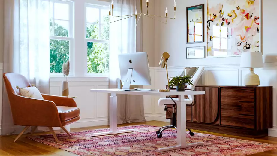
Some professionals spend thousands on a tailored suit, a professional headshot, and a polished portfolio. Then they hop on a video call in front of a cluttered bookshelf and a door with Post-it notes stuck to it, and undo all of it in an instant.
Your Zoom background is your first impression on every call. Here is how to make it work for you instead of against you.
Step 1: See What Your Camera Actually Sees
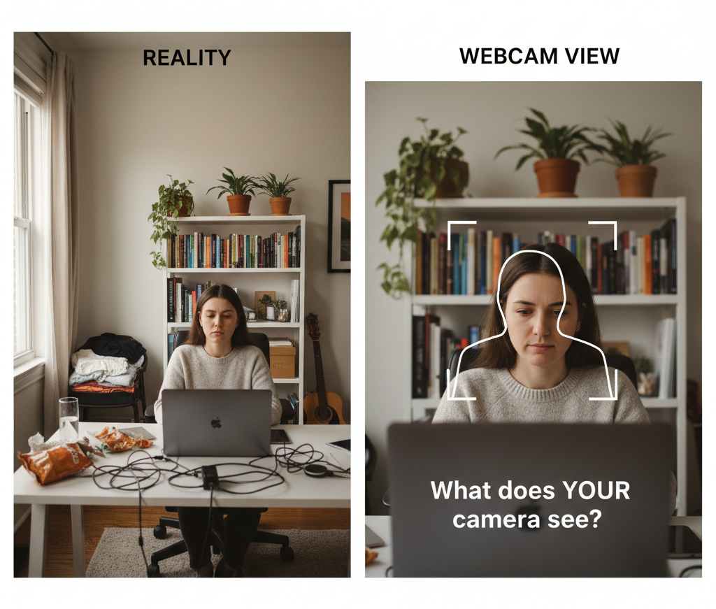
Before you move a single thing, open Zoom, start a test meeting, and look at your background through the camera. Most people skip this and end up styling a wall the camera never captures.
What to check:
- What is actually visible in the frame?
- Where does your head sit? (Eyes should land in the upper third.)
- What looks cluttered or distracting?
- How does the lighting hit your face?
Take a screenshot. That is your starting point for every decision that follows.
Step 2: Pick Your Background Location
You have three solid options depending on your space.
A wall 6 to 10 feet behind your desk. This gives you depth so you do not look flat and keeps the frame focused on a manageable area. Look for a wall that is relatively clear and does not have a window directly behind you.
A corner. Corners add natural depth and give you two surfaces to work with. They also tend to get better light from windows on adjacent walls.
A bookshelf. If you have one, half the work is already done. Bookshelves read well on camera and signal professionalism without much effort. The catch: it needs to be styled, not just crammed.
Step 3: Fix Your Lighting First
Lighting matters more than any decorative element. A beautiful background with bad lighting still looks unprofessional.
The rule is simple: your face should be the brightest thing in the frame.
Face a window, do not sit in front of one. Light from behind you creates a silhouette. Light from in front makes you look awake and clear.
Add a ring light if you can. A basic one runs $25 to $50, sits behind your camera at eye level, and eliminates shadows entirely. It is the single best upgrade you can make to your video setup.
Do not rely on overhead lighting alone. Ceiling lights cast shadows under your eyes and nose. Balance them with a front-facing source.
Test your lighting at different times of day. What looks great at 9 a.m. can look completely different by 3 p.m.
Step 4: Choose One Focal Point
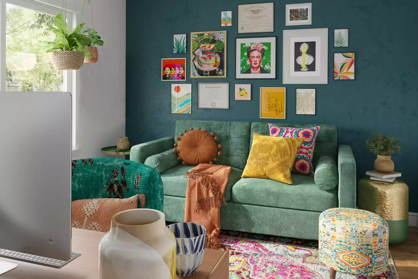
Your background needs one clear visual anchor. Without it, people’s eyes wander and they always find the wrong thing to land on.
A styled bookshelf. Use the thirds rule: one third books, one third objects, one third open space. Mix vertical and horizontal book stacks. Add a plant, a candle, or a small sculpture. Group items in threes or fives. Leave breathing room between everything.
A gallery wall. Three to five framed pieces creates a polished, curated look. Keep frame finishes consistent (all black, all wood, all gold), hang them at seated eye level, and choose simple art that is interesting without being busy.
A painted accent wall. Sometimes the cleanest solution is a single color or subtle texture. Soft blues, warm grays, muted greens, and taupes all work well on camera. Avoid bright white (glare), black (too harsh), and anything with a busy pattern.
Step 5: Add Depth With a Few Supporting Elements
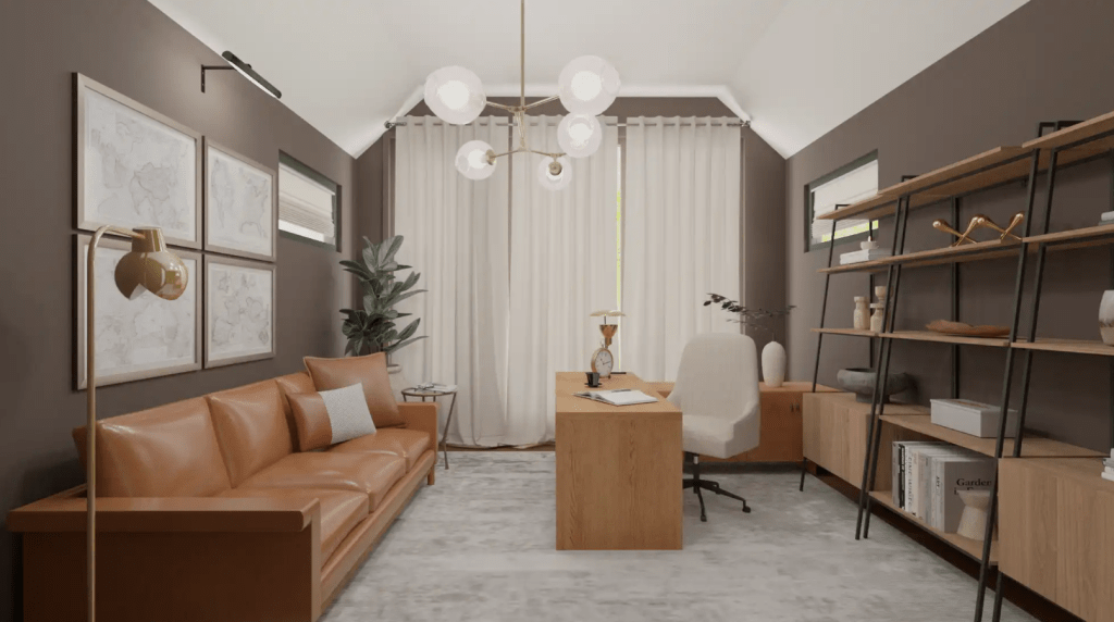
Video flattens space. You need to deliberately build layers back in.
A plant. Real or quality faux, a plant makes a space feel alive instantly. Place it to the side of your frame, not directly behind your head. Monstera, snake plant, and pothos all read well on camera.
A surface to style. A small console table or shelf gives you a place to layer in a lamp, a stack of books, and one or two objects. Keep it to three to five items maximum.
Texture. Mix materials so everything does not look the same on camera. A woven basket, a wood frame, a metal lamp, a linen throw in the corner of a chair. Contrast is what makes a background feel rich rather than flat.
Step 6: Stick to a Simple Color Palette
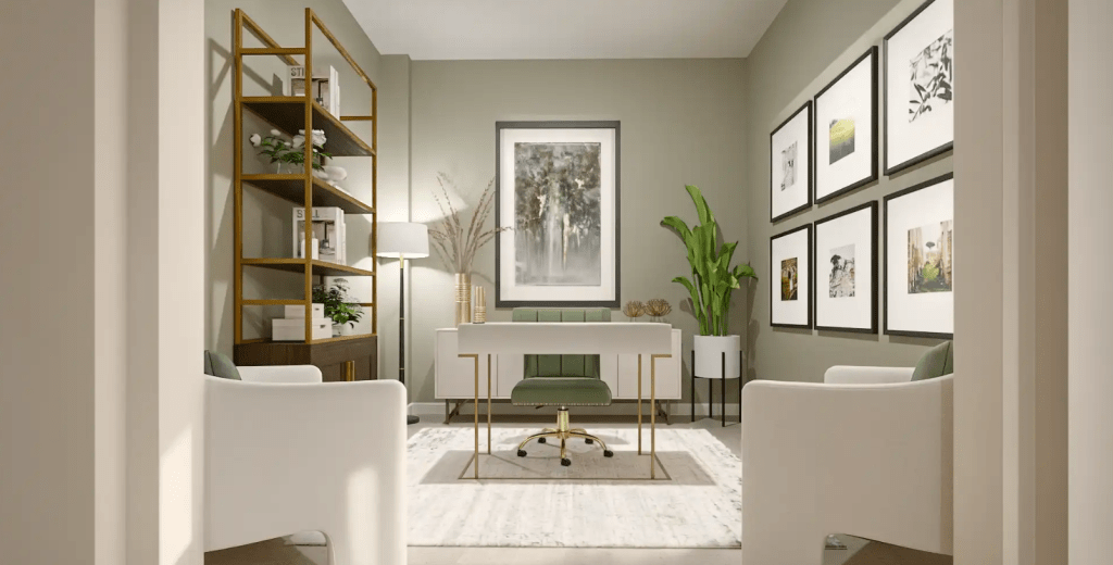
Limit your background to two or three colors plus neutrals. More than that reads as chaotic on camera.
Some combinations that work well:
- White or cream plus black plus one wood tone
- Gray plus navy plus brass or gold accents
- Cream plus terracotta plus natural wood
- White plus black plus one bold accent color
Also think about what you typically wear on calls. If you usually wear black, avoid a dark chair or you will look like a floating head. If you wear neutrals, you have more flexibility with color behind you.
Step 7: Fix Common Problems
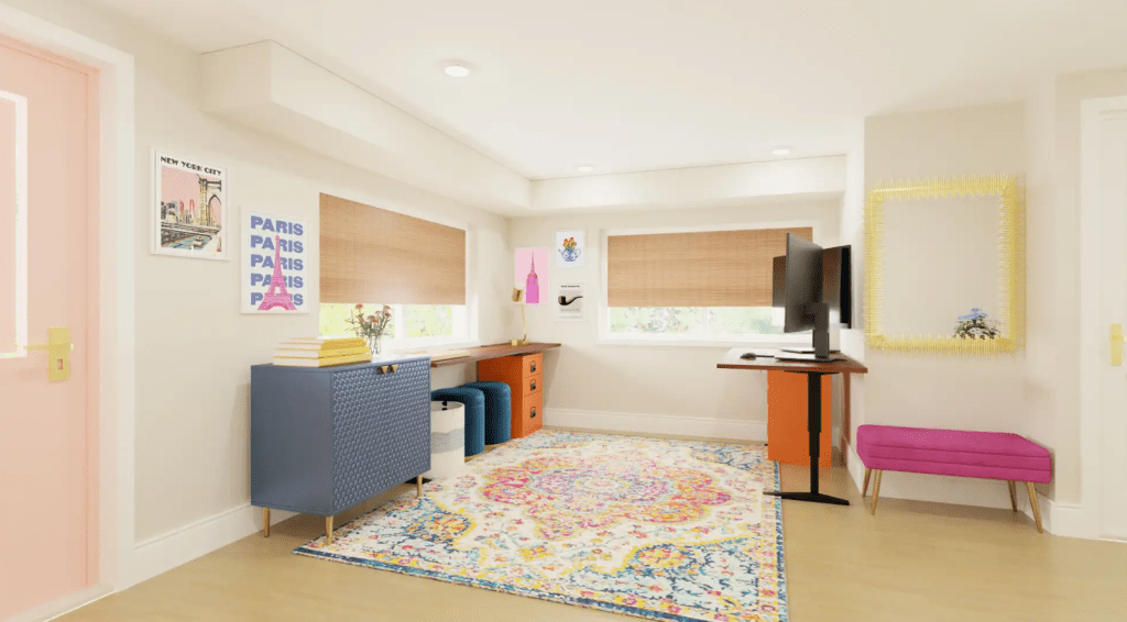
It looks cluttered. Remove half of what is visible. Then remove a quarter more. Less is almost always better on camera than you expect.
You look dark or washed out. Add a front-facing light source. This is a lighting problem, not a background problem.
Everything looks flat. Move further from the wall and add elements at different distances from the camera to create visual planes.
It looks too staged. Add one lived-in detail. A coffee mug on your desk, a book left open, a throw draped naturally over a chair. Perfect looks suspicious on video. Intentional-but-real looks credible.
Quick Upgrades Under $50
If you are starting from scratch, spend in this order:
- Ring light ($25 to $40). Bigger impact than anything else on this list.
- One good plant ($15 to $30). Real or realistic faux.
- Three matching frames ($20 to $30). Consistent finish matters more than the art inside.
- A basket or box ($10 to $20). To keep surfaces in frame clear.
You do not need to redecorate your entire home office to look professional on camera.
How to Keep It Looking Good
Style it once, then build a quick maintenance habit so it stays that way.
Before every call, do a 60-second scan: check what is in frame, remove anything that does not belong, and verify your lighting. That is it.
Keep a lint roller nearby for your clothes and any chair that appears in frame. Know how your setup looks at different times of day so lighting never catches you off guard.
The goal is a background that works without requiring daily effort. Simple to maintain is always better than impressive to photograph.
Frequently Asked Questions
Should I use a virtual background or a real one?
A real background will almost always look more professional. Virtual backgrounds glitch when you move, have visible edges, and signal to everyone on the call that you did not bother styling a real space. Even a simple, tidy real background beats most virtual options.
How far should I sit from my background?
Aim for 6 to 10 feet of depth between you and the wall behind you. Any closer and you will look flat and cramped on camera. The extra distance also gives your background elements room to read as separate layers rather than one cluttered surface.
What is the best color for a Zoom background?
Soft blues, warm grays, muted greens, and taupes all work well on camera. They are easy on the eyes, flattering against most skin tones, and read as professional without being sterile. Avoid bright white (causes glare), black (too harsh), and busy patterns (lose definition at video resolution).
Do I really need a ring light?
Not strictly, but it is the single highest-impact purchase you can make for your video presence. Natural light works well when positioned correctly, but it changes throughout the day and disappears on cloudy days. A $25 to $40 ring light gives you consistent, reliable light for every call regardless of the time or weather.
What should I put on my bookshelf for video calls?
Follow the thirds rule: one third books, one third objects, one third open space. Mix vertical and horizontal stacks. Add a plant, a candle, or a small sculpture. Group items in threes or fives and leave breathing room between everything. Avoid packing every shelf or using too many similarly sized items.
How do I make my background look professional without spending money?
Start by removing things rather than adding them. Clear visible clutter ruthlessly. Face a window for natural light. Use books you already own to style a simple shelf. Rearrange furniture to create more depth behind you. The biggest improvements almost always come from subtraction, not addition.
What if my camera faces a door?
A door is one of the trickiest backgrounds to work with because it is flat, featureless, and tends to look like you are being held in a waiting room. If moving your setup is not an option, the easiest fix is to add a piece of art or a small gallery wall directly on or beside the door to give the camera something intentional to look at. A tall plant or floor lamp placed to the side can also break up the flatness. If the door has panels or detail, a fresh coat of paint in a warm neutral can make it look deliberate rather than accidental. The goal is to make it look like a design choice, not a default.
The Final Check
Before your next call, run through these five questions:
- Is there a clear focal point you can spot in two seconds?
- Is your face the brightest thing in the frame?
- Would you feel confident on a call with your most important client?
- If someone screenshotted this, would you be okay with it?
- Does it look intentional without looking staged?
Five yes answers and you are done. Now the only thing anyone on your calls needs to focus on is you.
You Might Also Enjoy:





Leave a comment